Check out the fresh, new look to some of your favorite features.
While we’re very excited about all of the new features coming to My Diabetes Home, we are also thrilled to introduce you to the fresh, new look coming to the features you currently use. Most of these features will work very similarly but will just look better, cleaner and be more user-friendly! Take a look at the side-by-side comparisons below to get a feel for how these features will appear very soon.
The New Sidebar
We took the classic toolbar and flipped it on its side! The sidebar makes accessing what you need faster and simpler.
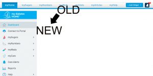
- Just like the old toolbar, the new sidebar is where you can access any tool you may need.
- Having access to everything on the side of your screen means no more scrolling to the top to find the next tool you need!
mySugars – Sugar Log
Just as before, you can either log your sugars from the dashboard…
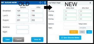
Or you can log them through your Sugar Log, which holds all of your numbers over time.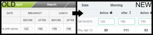
One difference in the new Sugar Log is the apple icon:
- A full apple indicates your blood sugar reading before your meal.
- An apple core indicates your blood sugar reading after your meal.
myNumbers
The old graphs that represent your different health numbers (A1C, weight, blood pressure, etc.) simply chart your data… The new graphs featured in My Diabetes Home 2.0 are much more interactive. For example, here is a possible graph of your logged A1Cs:
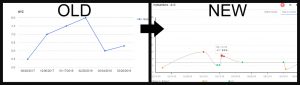
- If you hover over a specific A1C, the number and date it was logged are visible.
- Each A1C is marked as high (red), low (yellow), or in your target range (green).
- Tip: In the new mySugars section, the colors are reversed, meaning your low blood sugar will appear red. This is because we use the color red to indicate the most dangerous range. So, a high A1C reading is more dangerous than a low A1C and therefore is indicated by the color red. To read more about the new mySugars graph, check out this blog.
myCare (previously myVisits but now expanded! Read more)
Accessing myCare
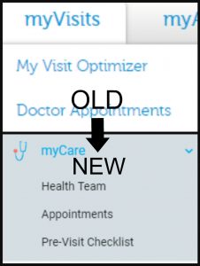
Previously known as myVisits, the myCare tab can be found on the sidebar. Clicking on myCare will take you to your myCare Dashboard, where you can access your Visit Optimizer.
Visit Optimizer
The Visit Optimizer has a fresh and cleaner look in My Diabetes Home 2.0.
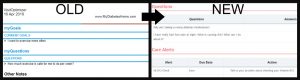
Here’s an example of the difference in part of your Visit Optimizer report. Our goal with the redesign of Visit Optimizer is to make it easier than ever for you and your doctor to communicate. To learn more about how My Diabetes Home 2.0 will significantly improve your doctors visits, click here.
Connecting Your Patient Portal
Connecting to your patient portal is easier than ever with My Diabetes Home 2.0. Previously only located in the top, right corner of the page, Connect to Portal is now also located on the sidebar.

Connect to Portal allows you to connect the patient portal of your primary healthcare provider directly to My Diabetes Home. This allows information such as A1C, weight, blood pressure, etc. to be automatically imported – saving you time while still allowing you to see trends and track your progress!
We hope these graphics and information have been helpful to you! Be sure to check out our additional blog post, introducing you to some exciting, new features.
— The My Diabetes Home Team
*Disclaimer: Certain features are subject to change as we receive feedback and further improve upon our site. We also reserve the right to designate certain features as Premium services as we progress in the launch of My Diabetes Home 2.0.
No Comments Yet